6 Easy Tips for Styling Your Built Ins.
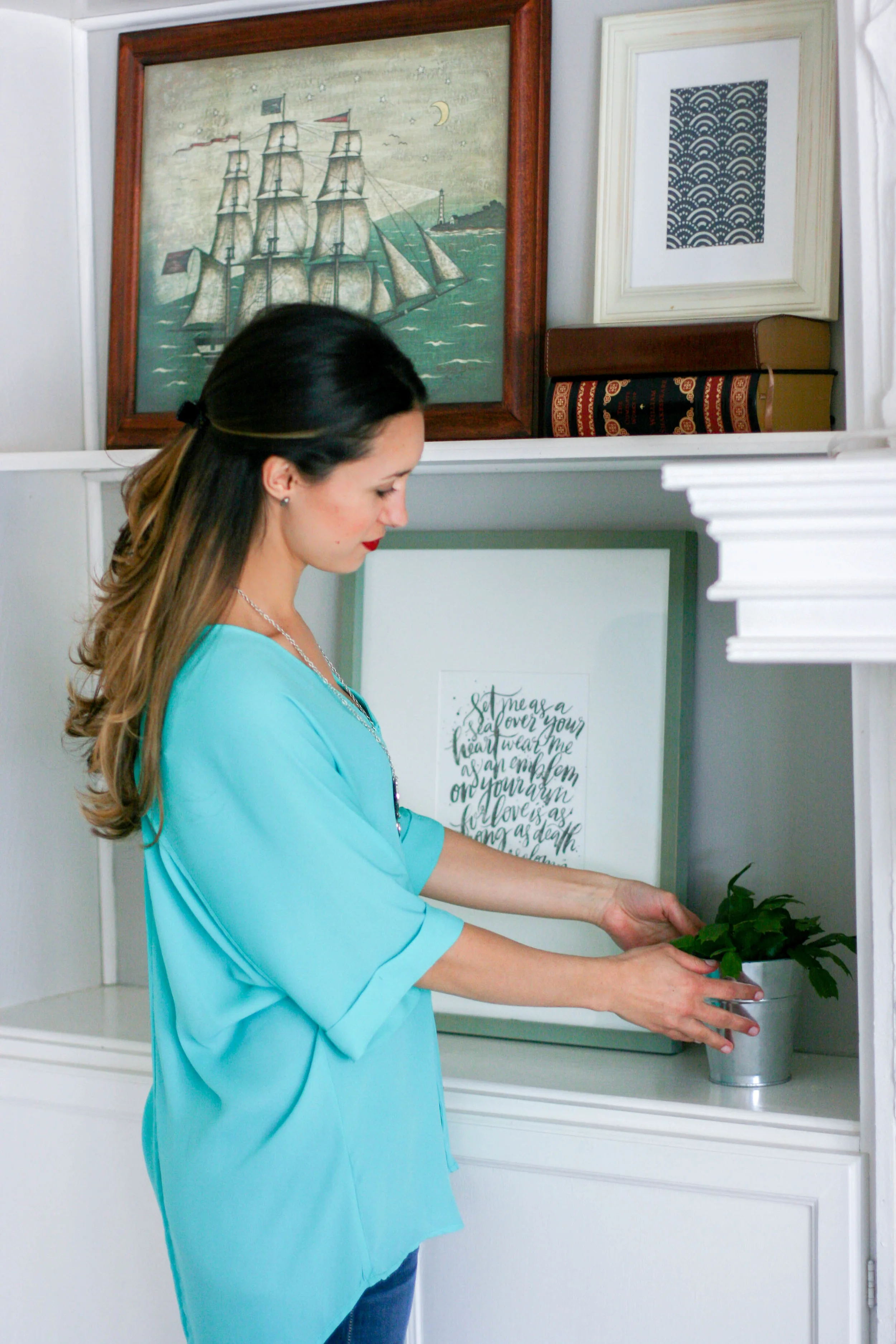
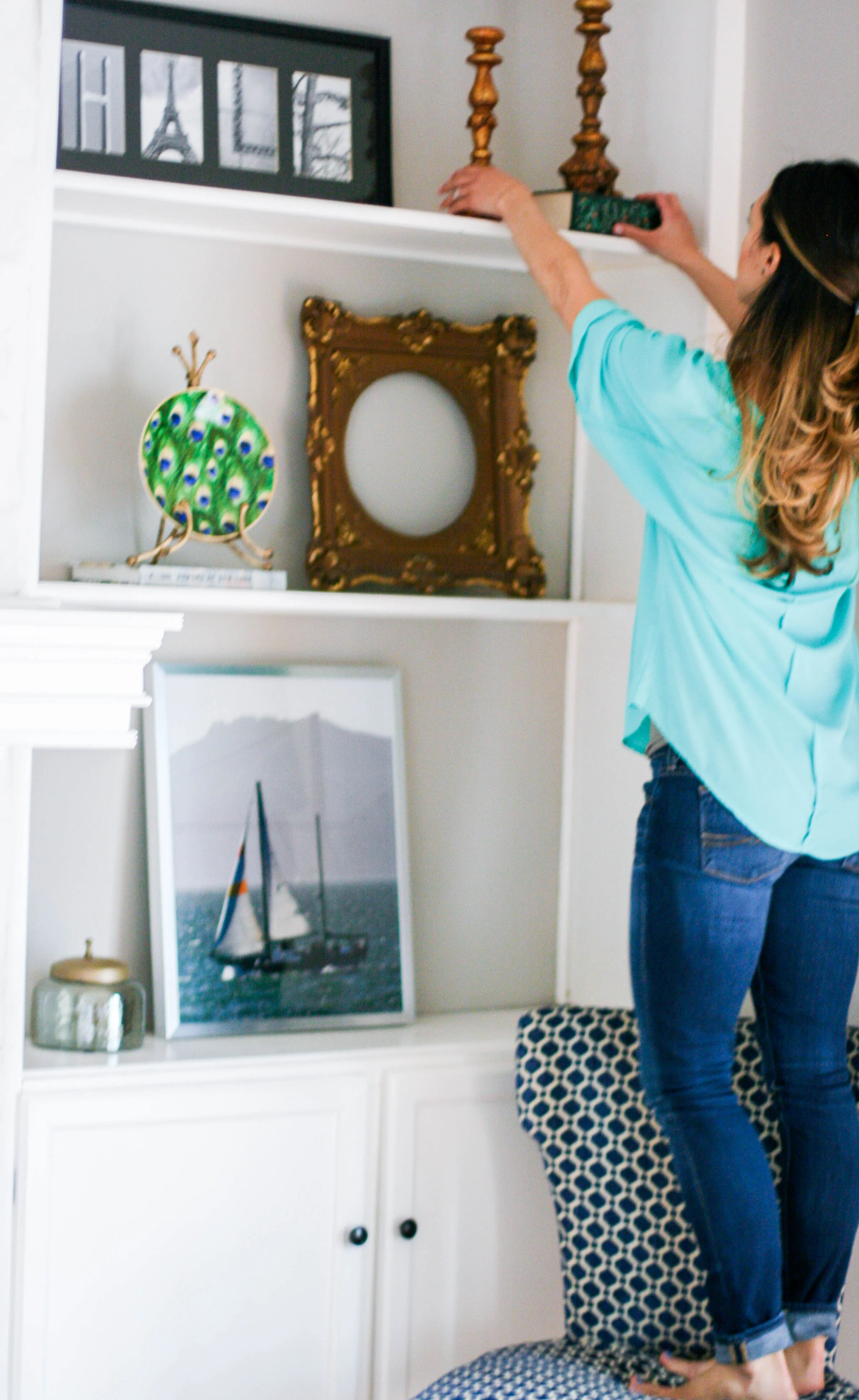
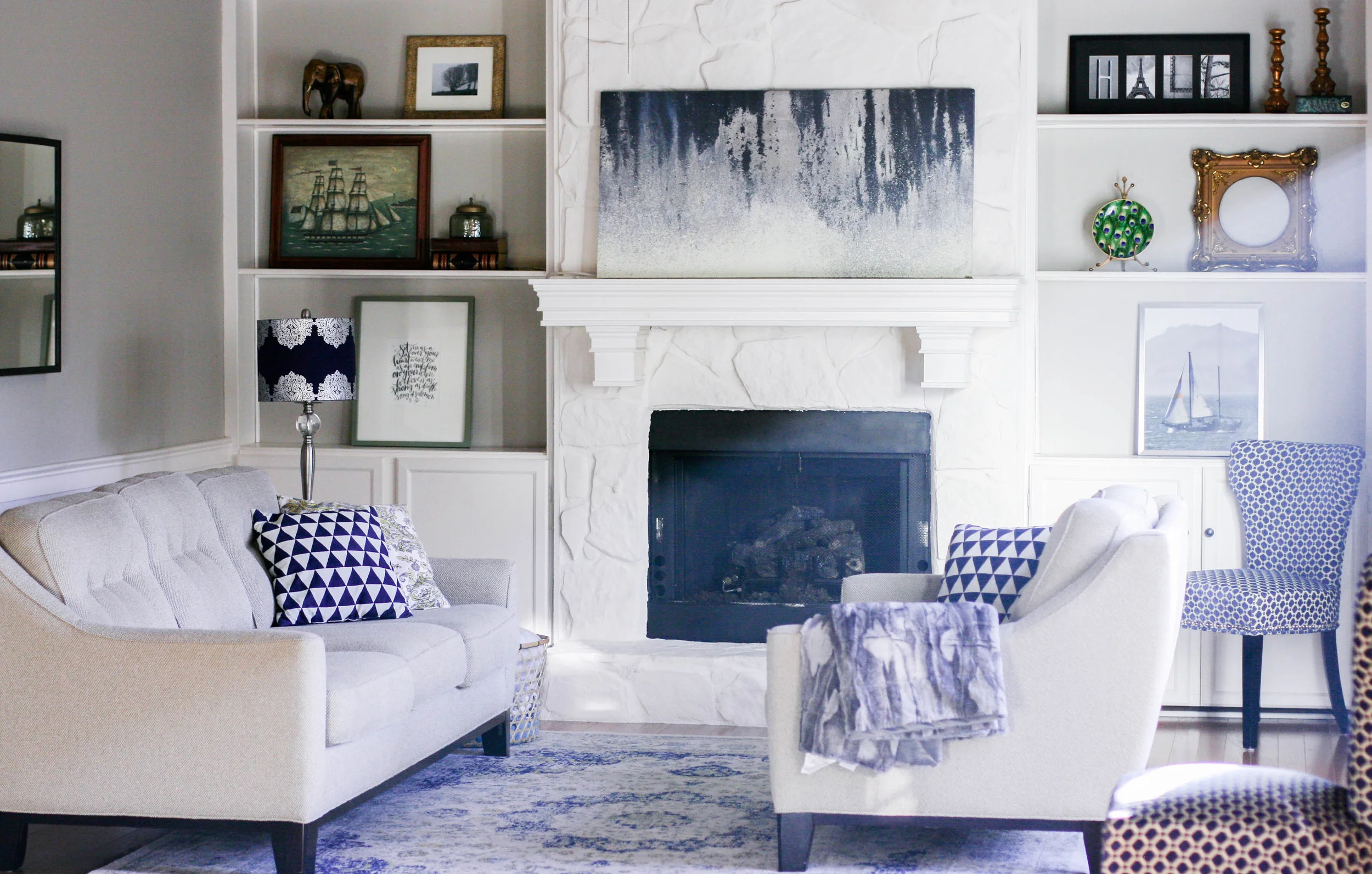
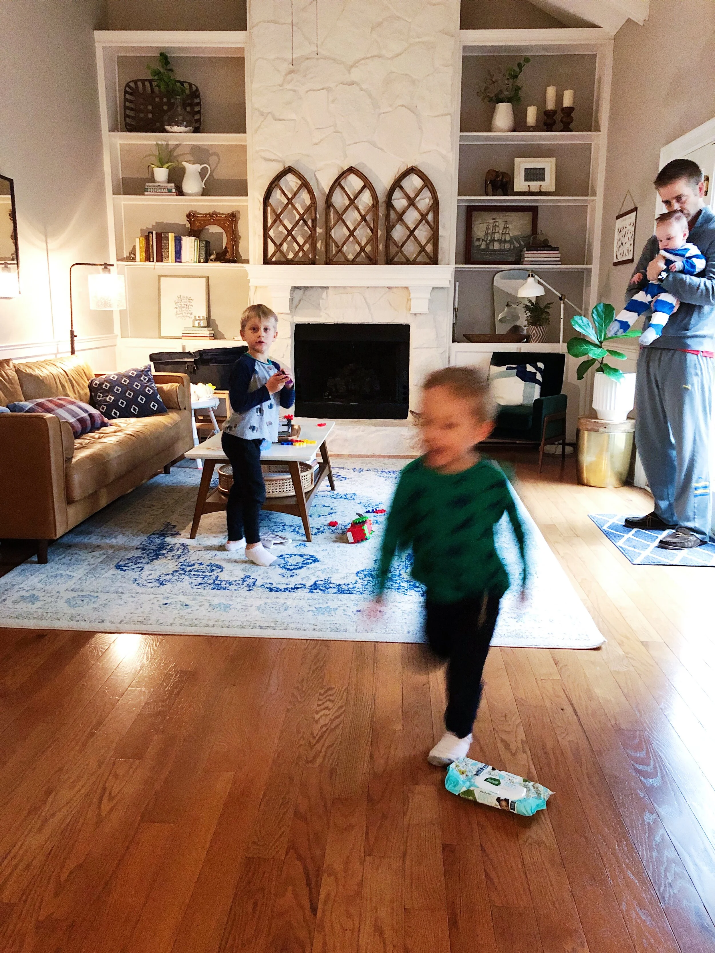
/A few weeks ago I shared a peek at our living room and the concept that went into the design. In my opinion, the things that really "make" this room are the high ceilings, the built-in shelves and the natural lighting. None of that really has to do with the decor. But those elements certainly enhance the decor and showcase its best qualities! I am a bargain shopper and don't really have a lofty budget to spend on home decorating. So I've combined a lot of items that were given to me or that I picked up inexpensively (some of them, literally, for free on the street!) Today I want to share my 6 tips for how to style built-in shelves easily and inexpensively.
1. Only Use a Few Items.
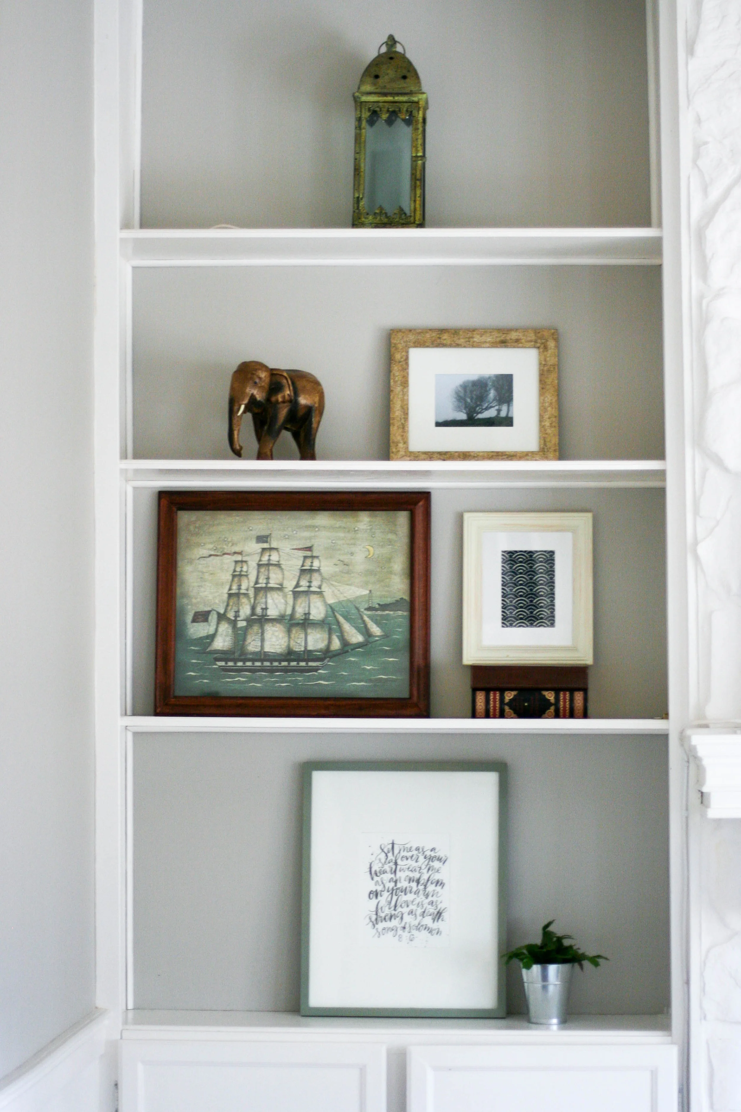
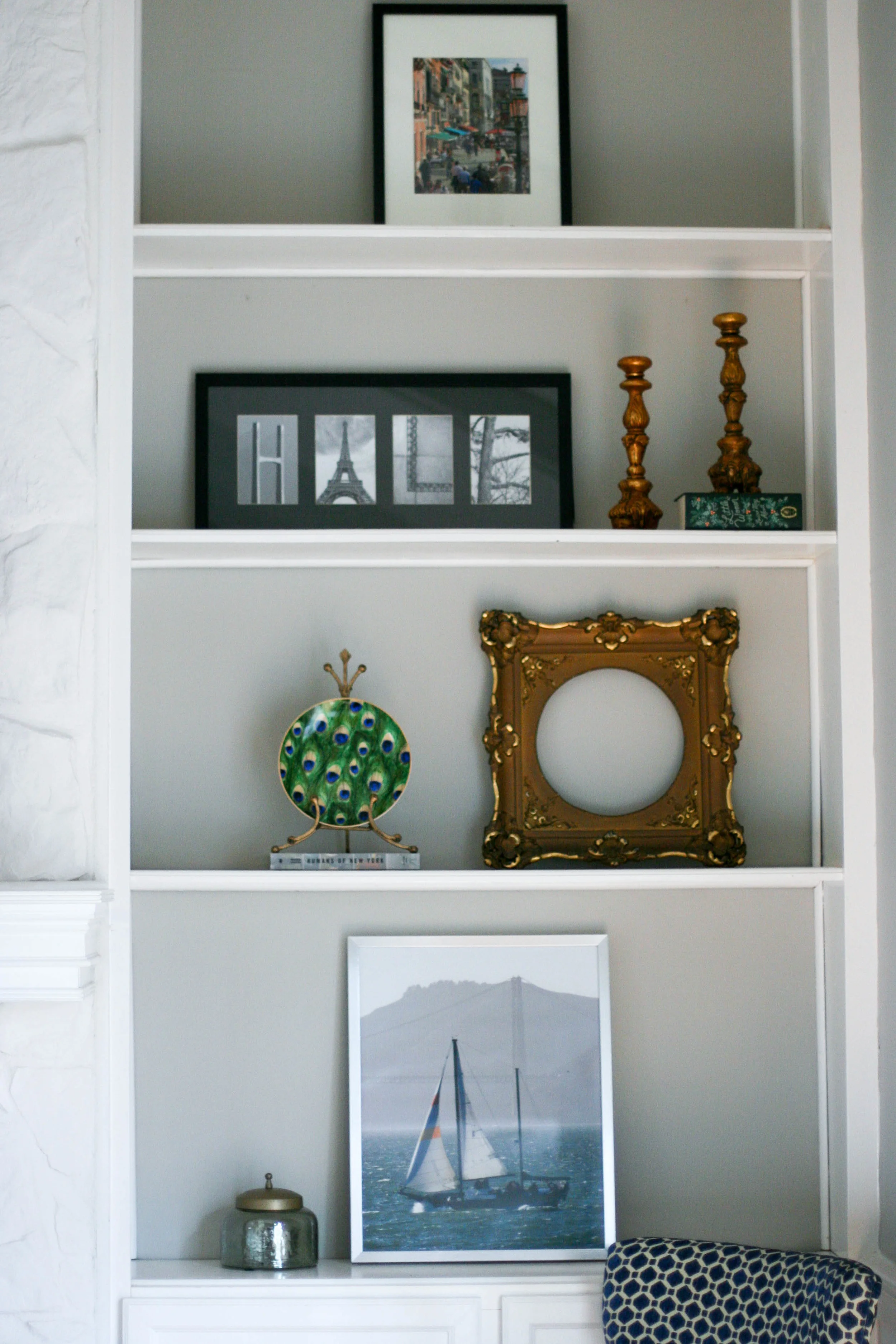
You know what you will love the very most about your shelves? How clean they look. It's really important to use less items than you think you need on those shelves. Trust me - this is what will keep them looking fresh and chic. Only use a few items! Between 1-3 for each shelf.
2. Keep the color palette complimentary - and neutral.
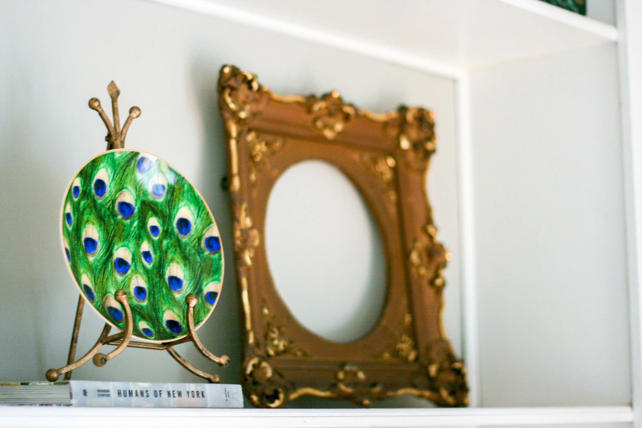
Pick a few shades that are represented in the room and stick to those tones. Your eyes will thank me. Because you will have so many different objects to look at, it's best to keep things in the family of neutral, with a hint of a color pop here and there. Use the colors already found in your room. In my case, I used a recurring theme of gold and silver elements, with lots of white space. Then I added a few pops of color, which coordinated with other colors in the room. The black frames coordinated with the black fireplace, the blue pictures coordinated with the main art piece and the rug, and the random pops of color came in the form of my green peacock-inspired plate and the wooden elephant.
3. Use different textures.
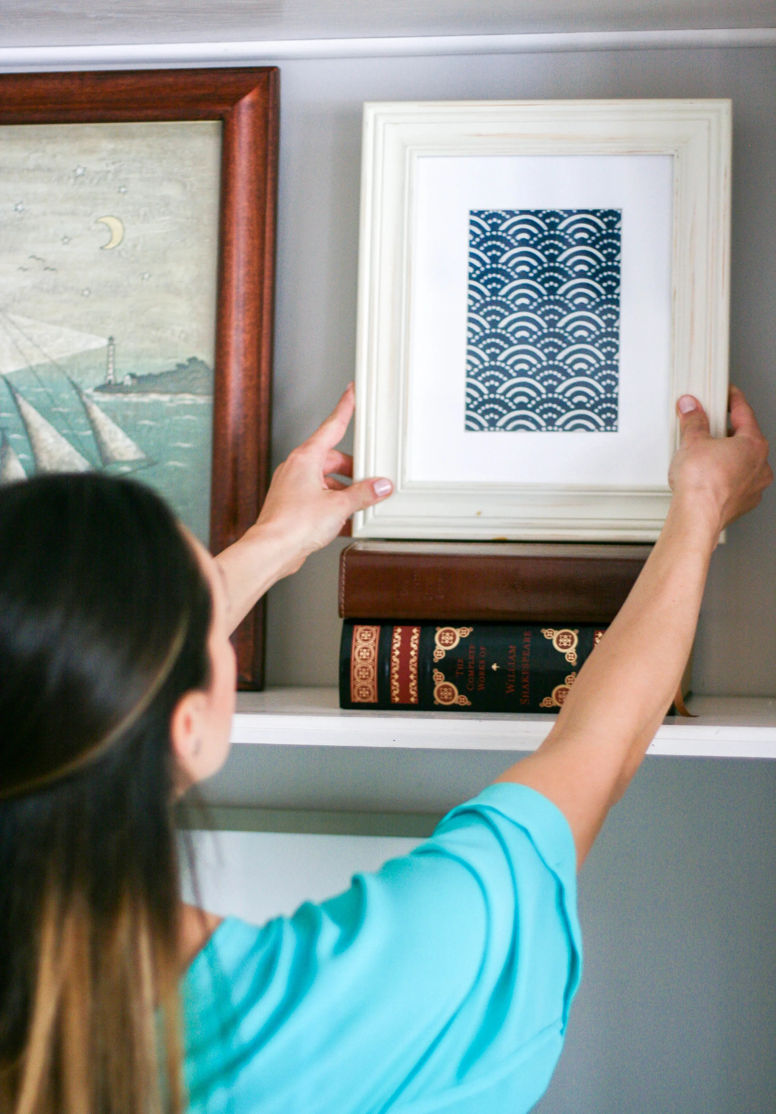
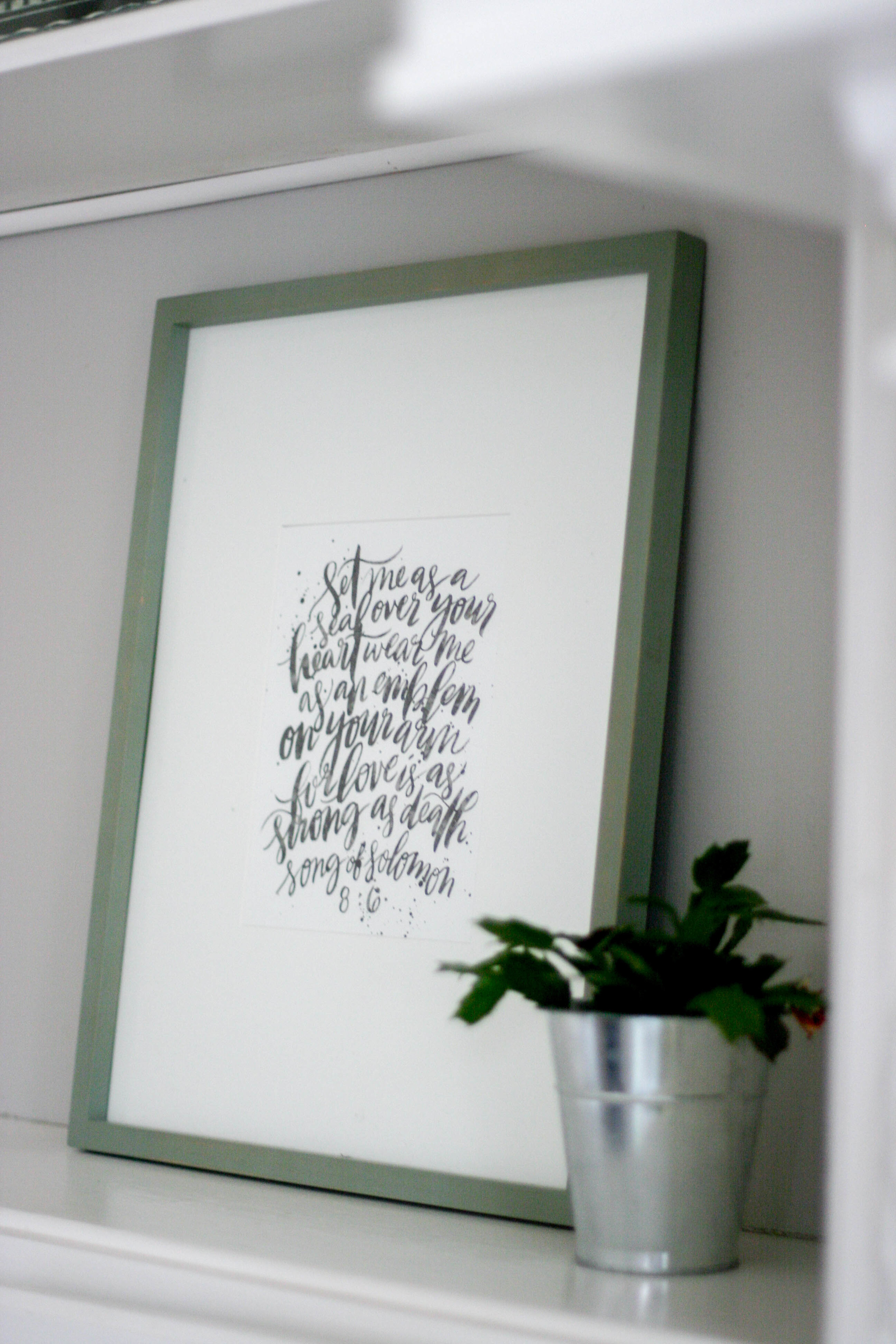
Using an array of textures on your built-ins is what makes the uniform palette come to life. Though the colors may play it safe, the types of objects and the different textures create enough intention to keep your eye interested for a while. For this reason, I mixed the elements and included glass, wood, live plants, framed fabric, books, etc. to create dimension on the shelves.
4. Include things you want to look at.
This might seem silly, but its not. So often, we can look at others' homes or flip through books (or watch HGTV) and think that the way someone else does something is the right way. But if we try to replicate that same look, it might not feel natural. It's important to use others' experiences as a launching point for inspiration, but make sure that everything you personally use in your home, especially on your built-in, that you completely love. Because at the end of the day, it's not a designer looking at your shelves everyday, it's you and your family. Make sure you love each of those items and want to look at them.
5. Consider the Scale.
In this case, the scale really matters. If your book shelves are enormous, you are going to want to use larger items to fill that space. Using tiny items in a big space can make the shelves look cluttered, which is the opposite effect you want to have. Make sure to choose varying sizes and shapes of items that fit to the scale of the shelves.
6. Never finish.
The most important (and often most frustrating) part of home decor is the journey: it's always a work in progress. But instead of letting this get you down, treat it like an exciting journey. There is always something inspiring on the horizon! Keep an eye out for items that you want to trade in and out on your built-ins. It will keep the scene fresh and hopefully keep your inspiration hat on. I am often walking books down stair and pictures upstairs, swapping their position in the house and finding where something feels "final". That almost never happens, but I like to put items somewhere on display for three months or so, then move it again, until it finally feels done. Let yourself enjoy the journey!
Thanks for reading! For more information about the items in this room, you can check the Living Room Home Tour post.


